

Choose the right digital marketing agency in Orlando for your business
Why should you increase your website's conversions? Because your want your visitors to become qualified potential customers.
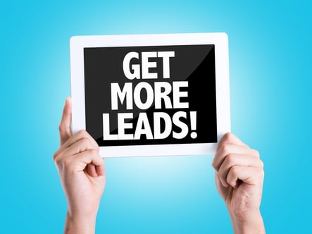
Call-to-Action (CTA) buttons are a common thing on websites and they are the ones who help us begin a buying cycle. These buttons include phrases such as:
- Free download this...
- Buy now!
- Click here for more information on...
Users click on them and afterwards are taken to a Landing Page where they'll share their contact information with your company. This is how you start creating a database with information of an specific market which is likely to buy your products.
Tips to improve these Inbound Marketing tools:
Call-To-Action Buttons
1. Improve the placement of these buttons.
They usually work better if place where they can be seen without scrolling down, that is, at the top part of the page. Only 50% of users that visit your website will see what's under this top part.
2.- Be clear about your offer.
Cut the chase and be specific about it. If you are sending a free guide to them, your CTA button should read: "Download our free guide on X". If you are hosting a free webinar, it should read: "Register now to take our free webinar on X". You must be clear about the benefit that the visitor will get from the offer. "Down load x for free " is more effective than a simple "Free article".
3.- Use images.
Images stand out more than text. They get a lot of attention. Also, an image can make your offer look even more attractive than with text only, since it can express much more, visually speaking.
4.- Use colors that contrast with the color palette of your site.
You web designer might disagree, but if your CTA blends with the rest of the page, it won't stand out. Don't you want lots of people to see your offer? if your answer is YES, then use contrasting colors to have them stand out.
5.- Add a hyperlink to your CTA button.
It will take users to the Landing Page that corresponds. You'll be surprised to know how often websites that have CTA buttons that lead nowhere. Wether it's intentional or a mistake, the lack of a hyperlink will make it hard for users to find a way to get your offer and will probably give up immediately. So check once, twice, or even thrice if necessary, to make sure that all the CTAs on your website reach their corresponding landing pages.
6.- Place them in the most relevant pages
Information shouldn't be the same for everyone. If your company offers different products or services, you might want to consider creating a different offer for everyone. You can then add hyperlinks to link each offer to the web pages that are related/relevant to the offer.
7.- Add a CTA on each of your blog posts
Whenever you create new blog content, choose an offer that would best match that blog entry. Add a CTA at the bottom of the blog post and link it to that offer's landing page. Informational offers such as ebooks, guides and seminars, are great for this strategy, since those who read your blog are probably interested in learning more about the topic.
Landing Pages
Landing pages are key yo convert your site's visitors into prospects to whom you can sell a product or service.
8.- Match the landing page title to the CTA that corresponds with it
Keep your messages consistent both on the CTA and the landing page title. If people click on a free offer and then find that there's an obstacle or a previous step to get to the landing page, you'll immediately loose their trust. Same happens when the CTA button is different from the landing page title. People might get confused and wonder if the CTA is linked to the wrong page.
9.- Be vey specific about your offer
This is the biggest mistake I've seen on landing pages. People often try to get too creative with the title but in the end, the offer isn't that clear to the client. Once again, if you are giving a guide away, have it read: "Download our free guide to improve X". Keep it simple!
10.- Improve the placement of the form that they'll fill in with their contact information
By doing so, there will be no misunderstandings about what the visitor is expected to do on this page: to fill in the form in order to later receive your offer.
11.- Keep the form as simple as possible
Simple doesn't mean short. What you ask for on the form must answer the questions that your sales team has about potential clients in order to close sales. At the beginning of a client's journey, maybe asking for their name and email could be enough, but as soon as they engage more and more with your content, you might want to ask for further information, such as location, phone number or title. Just don't ask for more than the necessary.
12.- Use images to show your offer
A landing page mustn't be a visual masterpiece yet, it must show what your offer is about. If your business is small and not so into design, you can make a screenshot of your guide/white paper/ ebook etc., and add it to your landing page. You can also use free software such as Jing in order to capture and save images easily.
13.- Keep text concise and easy to read
Be brief and get to the point. Aside from the title, write a brief paragraph explaining what the offer is about, followed by a few main ideas that better (and briefly) describe the offer and its benefits.
14.- Make an emphasis on the benefits of the offer
With only a couple of lines or a short paragraph, be very clear about the benefits of the offer. Instead of writing "It includes the specifics of X product" say "Discover how X can increase productivity by a 50%".
15.- No links or search buttons that would distract the visitor from filling in the form
When a potential client comes to your landing page, he's only a few clicks aways from sharing his contact information with you. Do not distract him with links that would take him somewhere else, away from your objective. Don't worry, the thank you page that is shown right after a form is filled, is the opportunity you have to bring him back to your homepage and other links, so he keeps lingering on your site.
16.- Create a thank you page that brings them back to your site
When a thank you page is created, not only it can bring your customers back to you site, it can also suggests links to other blogs related to the offer (client's interest). It can also include:
- Other CTAs that would help him take the next step in his buying process
- Links to your blogs
- Suggestions so they follow you on social networks (Instagram, Facebook, Twitter...)
- Subscriptions to your newsfeed
And much more!
You can make anything you want with your thank you page! Don't limit it to adding a follow-up code only.
Improving Offers
17.- Make sure your offers are convincing
Your offer must answer the question "What's in this for me?" that clients have. Such as:
- Catalogue with prices
- Specifications of the product or service
- Videos that show how it works
- Informational documents, guides, webinars
Everything that would give an answer to your clients questions.
18.- Link your offers to a page they'll relate them to
Give your customers a way to find your offers. You can always email your prospects about them but many won't read the whole email. Having a link on a page they can remember or relate to the same kind of offers, helps them browse back for more. You can also add links to your offers at your homepage to make this process easier for them.
19. Make an offer for each phase of the buyer's journey
Just like forms may vary for each stage of a client's buying journey, offers should too. While someone who's just getting started on his buying journey might want a basic guide or ebook, someone who is more advanced in this process might want a free trial or demonstration. Choose and create an offer for each buyer's journey stage and add a primary or secondary CTA according to each offer on your site. Automate the whole process so you don't have to manually do this every time, with every client.
Improving Email Campaigns
20.- Be very specific about your offer
I am repeating myself a lot for a reason: I've seen this mistake happen too often and it can be solved easily. You must always be very clear and specific about your offer. Write a short and simple email. For example, don't write a description of your offer that's longer than needed by adding paragraphs about your company's history. Cut to the chase! Which advice do you want to share with your potential customers? How can they benefit from subscribing to your blog? Why should they care about your site's new offer? Write about that only!
21.- Include links to your site
It's very hard to measure the success of your emails, we suggest you include links to your website so you can try different variations of your campaigns and measure what is working -and what's not. These links don't have to be a CTA that would take them to a landing page. You can link information on your blogs, suggest customers to follow you on twitter, etc.
22.- Keep the text concise and easy to read
People don't want to read dense paragraphs in their emails. Just like you'd do with a landing page, write a brief paragraph with information, advice, guidelines and, if they need more information, a link to your website.
23.- The title must be catchy
The "subject" line is the most important line of your campaign. Without a title that would catch your customer's attention, people won't read your email. No one will read what you have to say. What should you tell the customer so he reads your mail? The benefits of reading it.
24.- Limit the amount of images sent on your emails
Text emails are successful for a reason:
- They reduce the risk of being sent to a SPAM folder
- You'll have more success if your emails are written as if they were written for an specific reader, instead of sending an impersonal brochure to thousands of people.
Improving Your Whole Campaign
25.- Measure it and make tests
Everything that's on your site may be tested and adjusted in order to improve conversion rates. After a CTA has been on your homepage for more than a month, you may change the messages or replace it with a new CTA to find out which has a better result. If your CTA is on its second email campaign, more it to the thirs and see if rates increase. If a landing page has low conversion rates, move the form to the top and measure the results of this change. Don't be afraid of trying different variations, you can always go back to the first version if it worked better. It'll all be worth it once you find the combination that would increase the conversions of your site.
Need help?
If you feel you need some help during this process, you can always hire an agency and save money and time by reducing your learning curve. You can either ask for a single consultation or work with the agency during the whole campaign, it all depends on your company and its needs.


